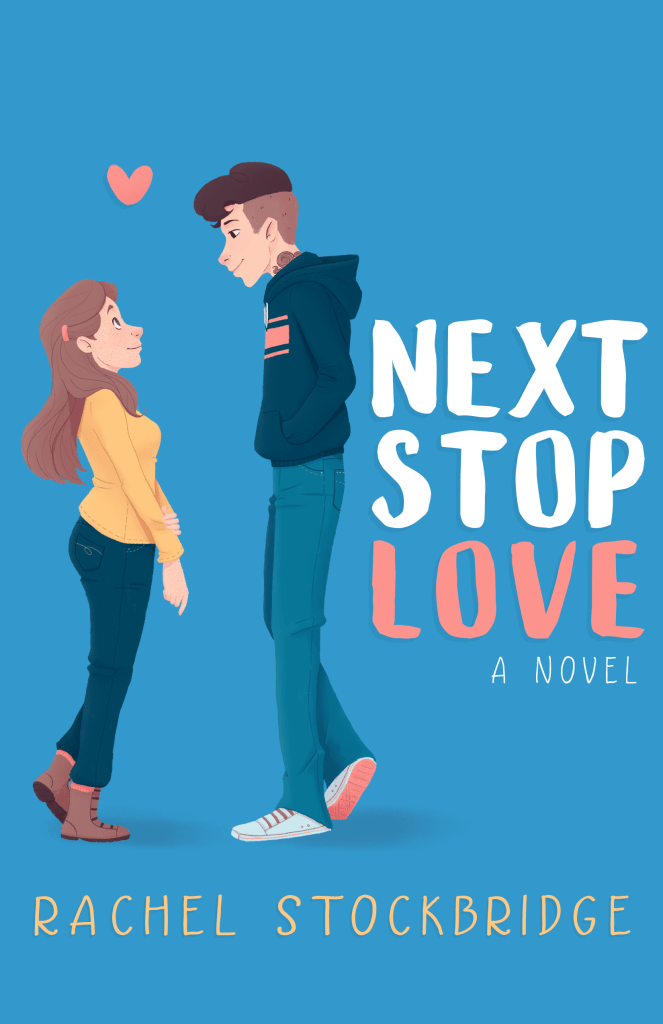
Let’s talk about the cover today! I have a little bit of design and illustration experience under my belt, so even though it’s usually a big indie publishing no-no, I actually did the cover by myself. I’m pretty happy with how it turned out, but it was a bit of a journey to get there. There were a few places where I almost threw the towel in and went to hire someone else, but on the whole I’m glad I powered through.

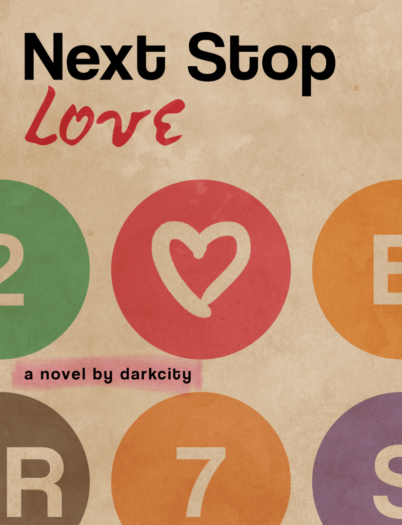
When I first started writing this book, away back in November of 2017, it was for National Novel Writing Month (NaNoWriMo). For those of you unfamiliar, NaNoWriMo is a challenge to write 50,000 words in a month, and on your profile you can put up a cover and synopsis. So naturally I had to do a mockup cover for NSL.
The main things I knew about the book at the time were that 1) it was going to take place in and around New York City, and 2) public transport–specifically trains and subways–was going to play a big part.
So I threw together a cover based on vintage NYC subway maps.

Not too bad for something I threw together in a few minutes! But I knew it wasn’t going to work as a real cover. For one thing, the book I actually wrote wasn’t what I thought I’d be writing going in. The dusty, grungy colors didn’t fit so much anymore.
On top of that, the above cover doesn’t give any clear indication of what the genre is. That’s a big problem.
Plus, I really wanted actual *people* on the cover. Abstract covers work in some cases, but it’s a tough sell when your book centers around a budding romance.
So I started brainstorming some other ideas. I’ve always been drawn to covers which feature illustrations (pun not intended1), and I thought bright colors fit the tone a lot better than the desaturated ones I started with. I wanted Next Stop Love to look at home on a shelf with books like The Hating Game and The Boyfriend Project and Eleanor & Park.
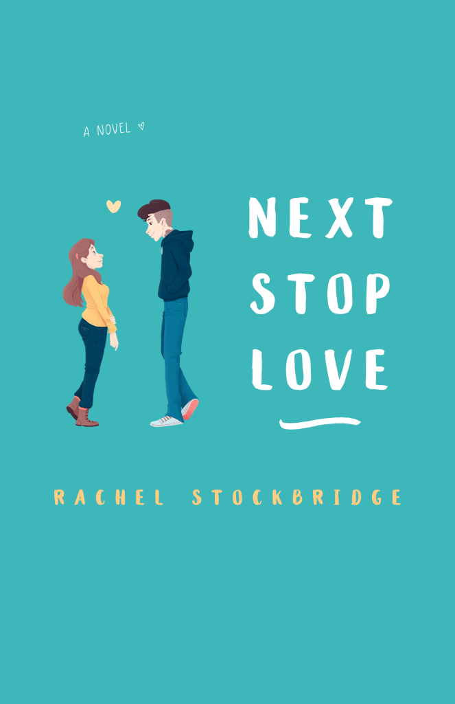
So I started sketching up different ideas, still thinking I was going to eventually hire a real live cover designer. Eventually I hit on this:

I thought it was incoperating a lot of the elements I wanted (it’s illustrated, the typefaces have a hand-drawn look, it’s closer to communicated genre and tone than the NaNoWriMo version), but something still felt off.
Unfortunately, that was when I hit a creative brick wall. I knew something was off, but I didn’t know what.
Fortunately, my sister is an artist with a great eye. She helped me to see what was wrong and get it working better.

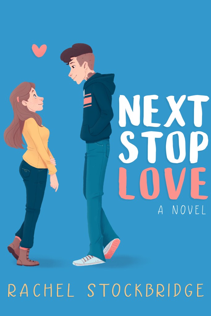
I made everything bigger, squished the title into a tighter block, and added a little more pink to Julian’s side of the illustration. That greenish teal became decidedly blue, and the skin tones got warmed up. I also added a couple of shadows, at someone else’s suggestion, to help ground the characters.
In the end, my book has a cover that I’m still really happy with. Hopefully the rest of you like it too! 😂
If you’d like to get a copy for yourself, there’s still a few days left to preorder the ebook, and you can buy the paperback from Amazon right now!
See you tomorrow for another blog post!
1 but heartily embraced
Text and images copyright © 2020 by Rachel Stockbridge. All Rights Reserved.

Leave a comment